
Full Desktop App Redesign + UX Workflow


Who is

Prenav is a California based company that leverages arial drones, LiDAR mapping, 3D analytics and deep learning to revolutionize the previously dangerous and costly methods of infrastructure and industrial inspections.
Prenav is a California based company that leverages arial drones, LiDAR mapping, 3D analytics and deep learning to revolutionize the previously dangerous and costly methods of infrastructure and industrial inspections.
What is

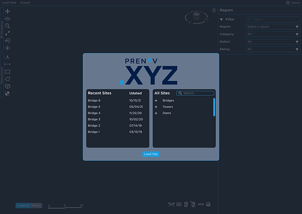
Prenav.XYZ is an application that displays a digital 3D twin of an inspection site, captured via drone imaging, and rendered by Prenav's AI systems. The application allows users to explore the inspection site by navigating a 3D space, where they can review defects marked by Prenav's AI, or measure and mark other defects and anomalies. These defects and measurements are organized within the apps reports library, where comprehensive inspection reports can be reviewed or exported.
The Project
Redesign
Produced by a small team of developers, Prenav.XYZ was designed function first, and usability had not been greatly considered. Many of the features of Prenav.XYZ were found to be confusing for users outside of the development team. Features are hidden or not communicated to the user. Unnecessary information and controls clutter the interface. Users have little or no direction in how to use Prenav.XYZ, or even where to start.
Additionally Prenav, requested insight around how to best implement a user centric experience design workflow to Prenav's development process.
This would be the most ambitious UX design project I have tackled, and I couldn't wait to get started.
Goals
Complete a full and comprehensive redesign of the whole of Prenav.XYZ based on user and comparative research:
-
Full UI visual redesign.
-
Produce new UI elements
-
Create high functioning and high detail UI component library for Prenav
-
Produce highly usable and friendly designs that communicate to new users
-
Develop new Design System including new colors and typeface
-
Conceptualize and redesign all user flows
-
Develop Prenav UX workflow to be utilized in future iterations
Constraints
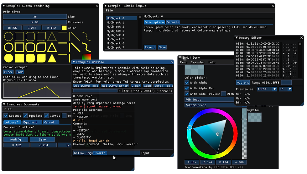
IMGUI Library
Prenav.XYZ was developed in C++ and utilizes an immediate mode graphic user interface known as IMGUI. This interface requires less coding and results in less errors, but any design elements must be built within the constraints of what this interface library can offer.
To produce designs that can be implemented and successful, I had to do a great deal of research into the IMGUI library and fully understand it's constraints.

Time
This initial redesign must be completed in its entirety within a three week design sprint.
The UX Team
Jim Richardson
Cheuk Kei Hui
Diego Vanegas
Tools
Figma
Produced all UI elements, atomically designed and prototype functional components
Figjam
Collaborative art space used for conceptual design
Procreate
Illustration and graphic editing
Blender
Design and conceptualization of 3D elements and interfaces
Maze
Managed usability testing and tracked metrics
Project Management
Before getting to work, the UX team got together to formulate strategy around how we would work together.
We aligned on what would be our daily and weekend working hours.
Decided how and how often we would communicate with each other and Prenav during the project.
Established how we would deal with disagreements and conflict.
Finding the best possible format for everyone on the team allowed us to work quickly and effectively with little time or energy spent on less productive issues.
Design Process
The UX team as a whole values the impact and effectiveness of user-centric design methodologies. Because we already knew that increasing Prenav.XYZ's usability and accessibility to it's users was paramount, we recognized that designs based on real user feedback would be the most successful.
We scheduled the three week project using the core phases of user-centric design process.
Week 1
Research
Week 2
Define
Ideate
Week 3
Test
Repeat
Research & Discovery


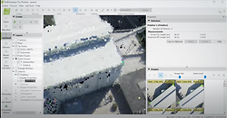
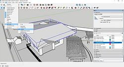
Current Prenav.XYZ Design
It was so important to familiarize ourselves thoroughly with the current and previous builds of Prenav.XYZ. This helped us fully understand the current user flows and identify pain points and successes.

Opportunities
-
Reused and repetitive icons
-
Busy and confusing interface
-
Little use of information architecture
-
Low contrast and visually difficult elements and design
-
No user direction or communication
-
Hidden features and shortcuts
-
Unusual control and navigation scheme
-
Development content
Here is a cursory comparison between the original design and the new redesign. Continue further to see just how we arrived at this design.
Original


Redesign


User Interviews
To begin our user research phase, Prenav was able to connect our team with real Prenav.XYZ users from around the world where we conducted interviews and observed screen-shared usability walkthroughs. Hearing detailed feedback from clients like the largest freight railroad network in North America, a top Japanese heavy-industry engineering manufacturer, allowed our team to gain a deep understanding of how users use, and want to use Prenav.XYZ
Insights
We reviewed all our findings and isolated core user sentiments into key insights. These were then mapped to easily discover reoccurring themes. These themes would drive our design process going forward.
Affinity Map
What We Heard
These interviews and usability tests displayed exactly what issues and opportunities were most important to Prenav.XYZ users. We were also able to recognize how different users with different goals used Prenav.XYZ differently.
Comparative Research
To further our research, we analyzed some comparator services and tools, especially those Prenav.XYZ users are familiar with. Even though Prenav.XYZ is a unique product, there are some standards to consider around 3D space navigation, photogrammetry, control schemes, and iconography.
Bentley Context Capture

AutoCAD

PIX4D
Revit
Drone Deploy
Sketchup

After review, we learned there were many standards that users are familiar with, that if adopted, would curb the learning curve of using Prenav.XYZ.
-
3D navigation schemes
-
User flows
-
Iconography
-
Onboarding
-
Information Architecture
Personas
Once we reviewed all our findings, we set off to give the Prenav.XYZ users' voices an identity. Creating two user personas allowed the team to design with real perspectives in mind. We also wanted to bring to life the two biggest use cases for Prenav.XYZ, bridge and tower inspection.
Charles

“I’ve got to rate the condition of every square foot of this bridge so organization is key”
Bio
Lives in the suburbs and works for a contracted company. Takes pride in assuring the safety of the infrastructure they inspect. Is extremely mindful of details. Is often on the road and phone with their team throughout the day.
Needs
-
Instruction on buttons
-
Organized collections of data
-
Same way to navigate 3D model as the other programs he uses
Goals
-
Understanding what all the buttons do
-
Produce clear standardized reports
-
Navigating through the 3D model efficiently
Frustrations
-
Don’t know what all the buttons do
-
When there are too many defects on the screen
-
Prenav has very different 3D control than other 3D programs he uses
Christina

“We’ve got produce clear and detailed reports that can be easily reviewed.”
Bio
Lives in the city working for a large firm. Connects with a large team over-see hundreds of towers. Is sure to collect every piece of information before working on a project. Likes to work fast and efficiently and values clear communications.
Needs
-
A filter feature on the report
-
Icon to help to navigate
-
Instruction on buttons
Goals
-
Going through the reports efficiently
-
See photos in 3D space efficiently
-
Starting with opening a site
-
Understanding what all the buttons do
Frustrations
-
Can’t find the specify defect on the report
-
Very hard to navigate though the photos
-
Have no idea what ‘octress’ does
-
Don’t know what all the buttons do
User Flows
We designed several user flows to illustrate and conceptualize how users would best explore and use the interface. Once many of these ideas were refined, we created user scenarios, featuring how our two personas might use Prenav.xyz.
Charles
Charles is using Prenav.XYZ for the first time. He’s new to the role, Charles has been tasked to use Prenav.XYZ to familiarize himself with the most recently inspected bridge and review the cracks in the foundation that were flagged by Prenav.XYZ AI. He also need to use the measurement tool to add the other defects to the report
Christina
Christina only wants to review specific defects on the report. She loads the existing site model. She needs to filter the report, so she can only review the specific defective element and also browse the photos.
Design
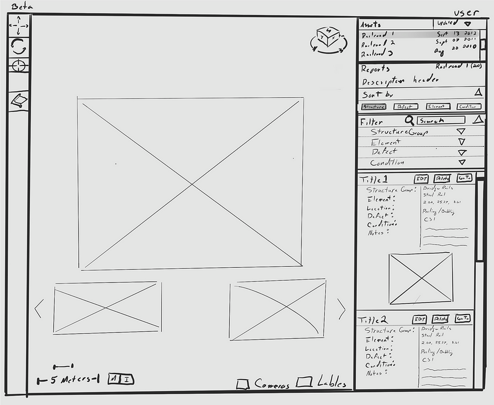


Sketching Concepts
Design Studio
To kick off our design phase we conducted a design studio session for the team to develop some low-fidelity solutions independently. We then brought these concepts together and iterated on them as a team to produce a final concept.
Double click to expand
 |  |  |
|---|---|---|
 |  |  |
Interactive Gallery ↓
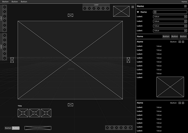
Wireframes
Once concepts were iterated on and vetted by the team, wireframes were produced as we began the process of rebuilding Prenav.XYZ in Figma.
Challenges
From our initial research, we identified several unique challenges that faced Prenav.XYZ users. Once these opportunities were prioritized, each solution was iterated on and tested several times in order to produce the most effective resolution.
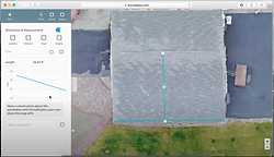
Bar Scale
We learned that for some users, it was difficult to understand the scale and distances of the 3D point cloud model. To make this clear at a glance, a reactive graphic scale key was designed. The design was based on the traditional distance key used in most architectural and engineering industries called a graphic scale or bar scale. The bar scale would be familiar to many Prenav.XYZ users, but we also kept the design simple and clear for users outside of these industries.

3D Compass
Users let us know that an understanding of cardinal directions within the 3D view of the asset and geography, is a major need. Prenav.XYZ had no way for a user to know what direction the view or objects are facing. Users could not identify the east side of a large bridge or the north side of a cracked pillar.
I decided to resolve this problem by producing an on screen 3D compass. Comparative research and Prenav.XYZ user insights helped design a simple but hybrid compass that displayed both cardinal direction and the core axis' of a digital 3D environment in which XYZ gets it's name. The cardinal directions are illustrated on a flat circular field that is always parallel to the ground plane or z plane. This allowed for direction to be seen at any angle while also giving the user perspective in the 3D space via the XYZ cube in the center of the design.
I designed the compass iterations as a 3D mesh using Blender.


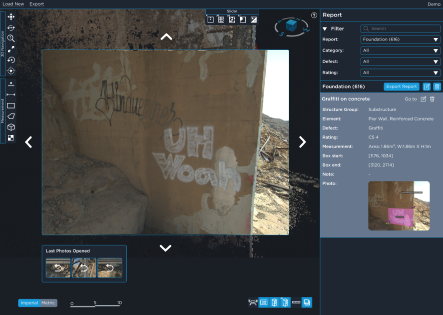
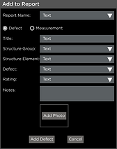
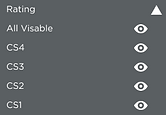
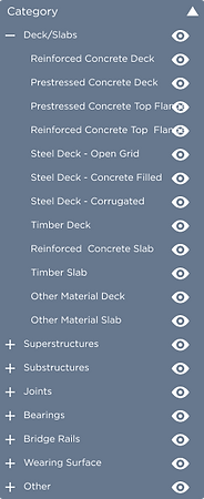
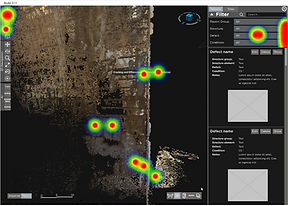
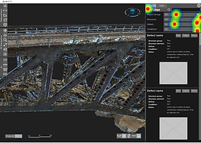
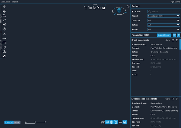
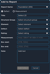
Reports and Categories
Every annotation, measurement, or defect of a 3D asset within Prenav.XYZ is saved as a report. A singular collection of 3d location, notes, and photo, categorized and stored. These reports are invaluable to Prenav.XYZ users and often the core component or requirement to a successful Prenav.XYZ user journey.
There was no option to sort or filter or search these reports. Users would have to scroll and search through a long list of sometimes, hundreds of reports, looking for a specific component or issue.
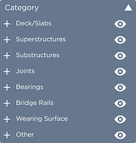
Industry Research
To iterate on a solution for this, we first did research on how this data is collected and sorted in the greater industries creating such reports. This lead us to understanding industry standards of industrial super and substructure elements and how their components are categorized.


We also had to familiarize ourselves with the industry standards for defect condition ratings, categories, options, and severity.
1 - Decks and Slabs
1.1 Reinforced Concrete Deck
1.2 Prestressed Concrete Deck
1.3 Prestressed Concrete Top Flange
1.4 Reinforced Concrete Top Flange
1.5 Steel Deck—Open Grid
1.6 Steel Deck—Concrete Filled
1.7 Steel Deck—Corrugated/Orthotropic/
1.8 Timber Deck
1.9 Reinforced Concrete Slab
1.10 Timber Slab
1.11 Other Material Deck
1.12 Other Material Slab
2 - Superstructures
2.1 Closed Web/Box Girder, Steel
2.2 Closed Web/Box Girder, Prestressed Concrete
2.3 Closed Web/Box Girder, Reinforced Concrete
2.4 Closed Web/Box Girder, Other
2.5 Girder/Beam, Steel
2.6 Girder/Beam, Prestressed Concrete
2.7 Girder/Beam, Reinforced Concrete
2.8 Girder/Beam, Timber
2.9 Girder/Beam, Other
2.10 Stringer, Steel
2.11 Stringer, Prestressed Concrete
2.12 Stringer, Reinforced Concrete
2.13 Stringer, Timber
2.14 Stringer, Other
2.15 Truss, Steel
2.16 Truss, Timber
2.17 Truss, Other
2.18 Arch, Steel
2.19 Arch, Other
2.20 Arch, Prestressed Concrete
2.21 Arch, Reinforced Concrete
2.22 Arch, Masonry
2.23 Arch, Timber
2.24 Cable – Main, Steel
2.25 Cable – Secondary, Steel
2.26 Cable – Secondary, Other
2.27 Floor Beam, Steel
2.28 Floor Beam, Prestressed Concrete
2.29 Floor Beam, Reinforced Concrete
2.30 Floor Beam, Timber
2.31 Floor Beam, Other
2.32 Pin, Pin and Hanger Assembly, or both
2.33 Gusset Plate
1 - Appurtenances
1.1 Antenna
1.2 Dish
1.3 Lightning Rod
1.4 Mount
2 Compound
2.1 Enclosure
2.2 Fence
2.3 Tank
3 Tower
3.1 Fasteners
3.2 Foundation
3.3 Structure
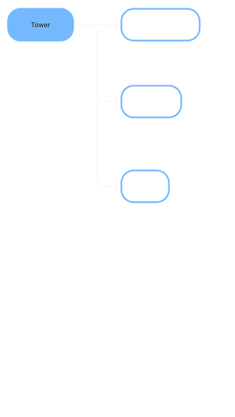
Category Tree & Dropdown Menu
Comparative and user research pointed the UX team toward developing a tree structure for selecting from large groupings and simple dropdown menus, ordered hierarchically.


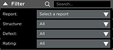
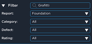
Filters and Search
To eliminate as much friction as possible when searching through a long list of detailed and categorized reports, the UX team designed clear and immideate options for filtering and searching categories and keywords.
Filtering for Grafitti

Search for Grafitti
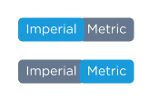
Unit Toggle
When exploring the 3D point cloud or reviewing reports all units of measurement are lengthily presented in both metric and imperial units. The added clutter of extra text throughout contributed to the busy and confusing interface.
The solution designed to resolve this was a unit of measurement toggle button located on the 3D view pane.
Iconography
A core obstacle to the intuitive understating of how to use Prenav.XYZ, is a lack of communication to the user. A fundamental example of this is how Prenav.XYZ uses identical or very similar icons to represent different tools or features.
A complete redesign of all tool and feature icons had to be thoughtfully crafted based on standards discovered through comparative and industry research.
Original Icons

New Icon Designs

Onboarding
A major obstacle brought to us by Prenav.XYZ users was the sentiment of not knowing where to start. Much of Prenav.XYZ's controls are unintuitive, hidden, or confusing.
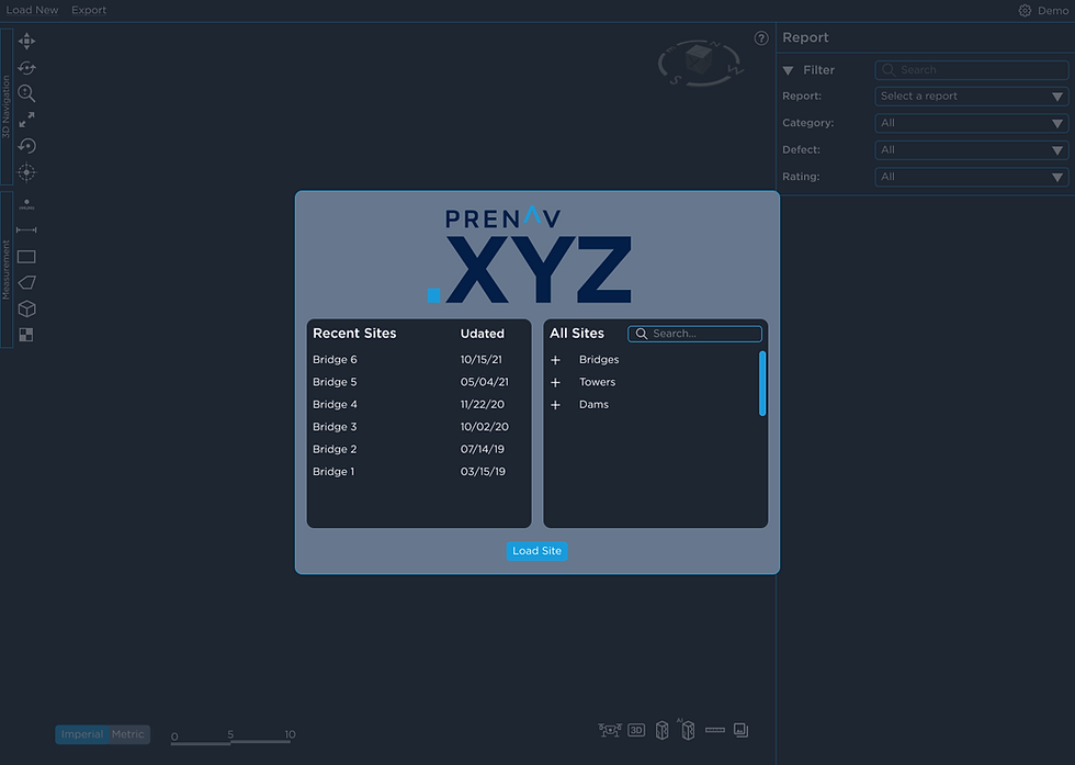
Load Site - Isolated Prompt
New users especially struggled with Prenav.XYZ. The first time you launched the app, there was no direction or indication as to how you might perform the first possible function, loading a 3D asset to view.
To simplify this process for the user, we eliminated all other functions and distractions upon launching Prenav.XYZ. Now guiding you through the initial process of loading a 3D asset for review.
Tool Tips
In addition to simplifying the products interface and user flows as a whole, we wanted a layer of extra support for new users. After several considerations, automatic but unobtrusive tool tips were decided to be the best solution to help guide users.


Design System
Once our functional designs and user flows were fully conceptualized, we focused on visual design and cohesion. For consistency, cohesion and hierarchy, I iterated, tested, and ultimately produced a final version of the Prenav.XYZ design guide. This is a document that will guide the design and future iterations of Prenav.XYZ, and will be delivered to Prenav as a tool to use for further development.
Design Ideals
To start, I refined a list of ideals and themes that encapsulates Prenav as a company. These concepts would be used to guide the design of Prenav.XYZ as well as future iterations.
-
Professional
-
High tech
-
High contrast
-
Descriptive
-
Accessible
-
Hierarchy
-
Intuitive
-
Standardized
-
Efficient
-
User centric
-
Consistant
Color Palette
The Prenav.XYZ color palette was based off of the blue themes already in use with the Prenav logo, but altered and expanded to be more functional for UI elements. High contrast is continuously utilized to highlight features while not being overbearing.
Background
#1E2632
Outline
#199BDB
Hover
#67788E
White
#FFFFFF
Secondary
#777F86
Black
#000000
Typography
We knew it was vital to maintain a consistent and thoughtful usage of a typographic hierarchy for clear and functional communication.
Font Family
Gotham font family developed by Hoefler & Co is used exclusively due to its versatility, readability, and modern design.
Gotham Medium is used for titles and headers.
Gotham Book is used for body content.

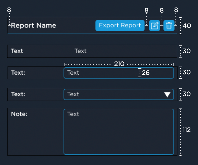
Interface Components
Within the design guide, interface components are labeled with description, measurements, and guides for application.


Prototyping
& Testing


Low-fi Prototype & Usability Testing
Method
We created a low fidelity clickable prototypes of the Prenav.xyz interface using Figma. With minimal visual design, this prototype was designed to test functionality first.
User scenarios were developed to test the flow of each process. These prototypes were uploaded to a service called Maze for usability testing and tracking. Because we wanted to know if our designs were intuitive to new users, we conducted tests with eight users who have never used Prenav.XYZ.
User Scenarios
Scenario 1
You're a Civil engineer inspecting bridge 16 and looking out for defects on the structure.
Task
Launch Prenav.xyz and load the 3D asset called Bridge 16.
Scenario 2
You're working on the foundation report. You found a graffitied area and you want measure it and add it as a defect to the report you're working on.
Task
Measure the graffiti and add it to a report.
Scenario 3
There is now a long list of reports and you want to review the graffiti defect added earlier and inspect the report's photo.
Task
Find the graffiti defect and view the photo.

Takeaways
With an 80% task completion success rate and only 2 instances of users navigating outside the expected flow, the design appeared to be simple and intuitive to most testers.
The testers comments let us learn a little more about their expectations around feature locations and how they thought the iconography was clear but they still weren't sure what each tool does.
These insights helped us adjust where some icons were positioned and also spurred the further development of tool tips.
"Flow and labels were unclear at first."
"I'd like be able click on whole line not only on the icon (defect or something); All visible (icons are changing but command No, confused a little). Would love to see hints when I hover on icons (left menu - vertical bar). But even with all these things - design is pretty clear and SO beautiful! "
High-fi Prototype & Usability Testing
Method
After taking time to review the feedback from our first round of testing, we began to iterate solutions. Once we had developed resolutions to the issues raised in testing we produced a high fidelity clickable prototype for advanced testing. This high fidelity prototype was produced with full visual design and offered opportunities to test functionality, usability, and aesthetic.
For this round we continued to use the same scenarios as they test core functionality, but with a batch 12 of new users. Happily, here we saw success rates improve even more.
User Scenarios
Task 1
Launch Prenav.XYZ and load the 3D asset called Bridge 16.
Success:
100%
Time:
Misclick:
Bounce:
7.1 s
5%
0%
Task 2
Measure the graffiti and add it to a report.
Success:
91.6%
Time:
Misclick:
Bounce:
31.5 s
12%
0%
Task 3
Find the graffiti defect and view the photo.
Success:
83.3%
Time:
Misclick:
Bounce:
65.2 s
8.3%
0%


Takeaways
With this series of testing we saw an increase in task success percentage, letting us know our designs were clear and intuitive, even to bran-new users.
We did see however that time per task completion was a little longer overall but while reviewing the tester click heat map, Maze offers, we were able to see that users were interested in clicking around and exploring the high fidelity interface before completing the task at hand.
"Fairly straightforward, but I did use the tool tip information to get more information about what the tool did"
"Yes, filters were easy. I like the eye icon for displaying the filters on/off. That was unique and felt intuitive."
"The location of the measurement tool. I thought it was the ruler in the bottom right at first, then discovered it in the top left."
Deliverables

Comprehensive Design
The paramount deliverable was the full visual and user flow redesign of Prenav.XYZ. The redesign was built using Figma.


Figma Library
A very important deliverable was the Figma library itself. A detailed and functional component library, designed atomically, was produced to ensure easy and consistent future iterations.
Design Guide
A document defining the direction and constraints of the redesign was requested to support development hand-off and future design efforts.
Included:
-
Design Ideals
-
Design Methodology
-
Color Palette
-
Constraints
-
Hierarchy
-
UI Elements and Descriptors
-
Tool Guide
-
Typography


UX workflow
A document outlining the UX iterative design process and, how it may be adapted into Prenav’s current development process was requested and produced to aid future user centric improvements.
Included:
-
User Centric Design
-
Ideation
-
Handoff
-
User Research
-
Visual Design
-
Project Management
-
Testing


Reflections
Conclusion
Working on a product that makes a positive impact on the world is the ultimate achievement for me. Prenav.XYZ provides a more efficient, and much safer solution to industrial inspections which on its own, is paramount to public safety. It was more than enriching to help develop the next iteration of such a impactful product.
To date this has been by far the most challenging, in-depth, and rewarding UX project I have completed. The scale and quality of work that our small UX team produced was great especially considering the time, technical, and industry constraints.
A full product redesign is an ambitious prospect on its own, but owning the entire process from interviewing users, to handing the full project off to development was extremely rewarding.
This project tested every aspect of my technical and non-technical skills; interviewing, project management, 3D modeling, visual design, prototyping, and so much more.
I learned so much during this process its hard to highlight any number of takeaways. However managing this project and guiding my UX team, developed my leadership skills while at the same time helped push our team to produce more content and quality than we thought possible, considering the constraints.
I am so excited to continue my work with Prenav, as well as taking the experience I learned to other products.
Looking Ahead
I am excited to continue my work on Prenav.XYZ.
There are many improvements beyond this redesign that have been discussed and conceptualized. I look forward to developing Prenav.XYZ further to tackle such issues:
-
More Annotation Options
-
Support Additional AI
-
User Personalization
-
Expand Reports
-
New Colors Scheme for 3D
-
Report Export Design
-
Further Testing
-
Improve 3D Tools